Spec Systems
A Business Brand with a Personal, Eclectic Touch
Parachute Strategies began working with Spec Systems, an architectural-product rep specializing in acoustical products and panelized building finishes, in 2018. Spec Systems has representatives in three states, and serves architects and contractors on commercial projects throughout the Pacific Northwest, Alaska, and southwestern Canada.
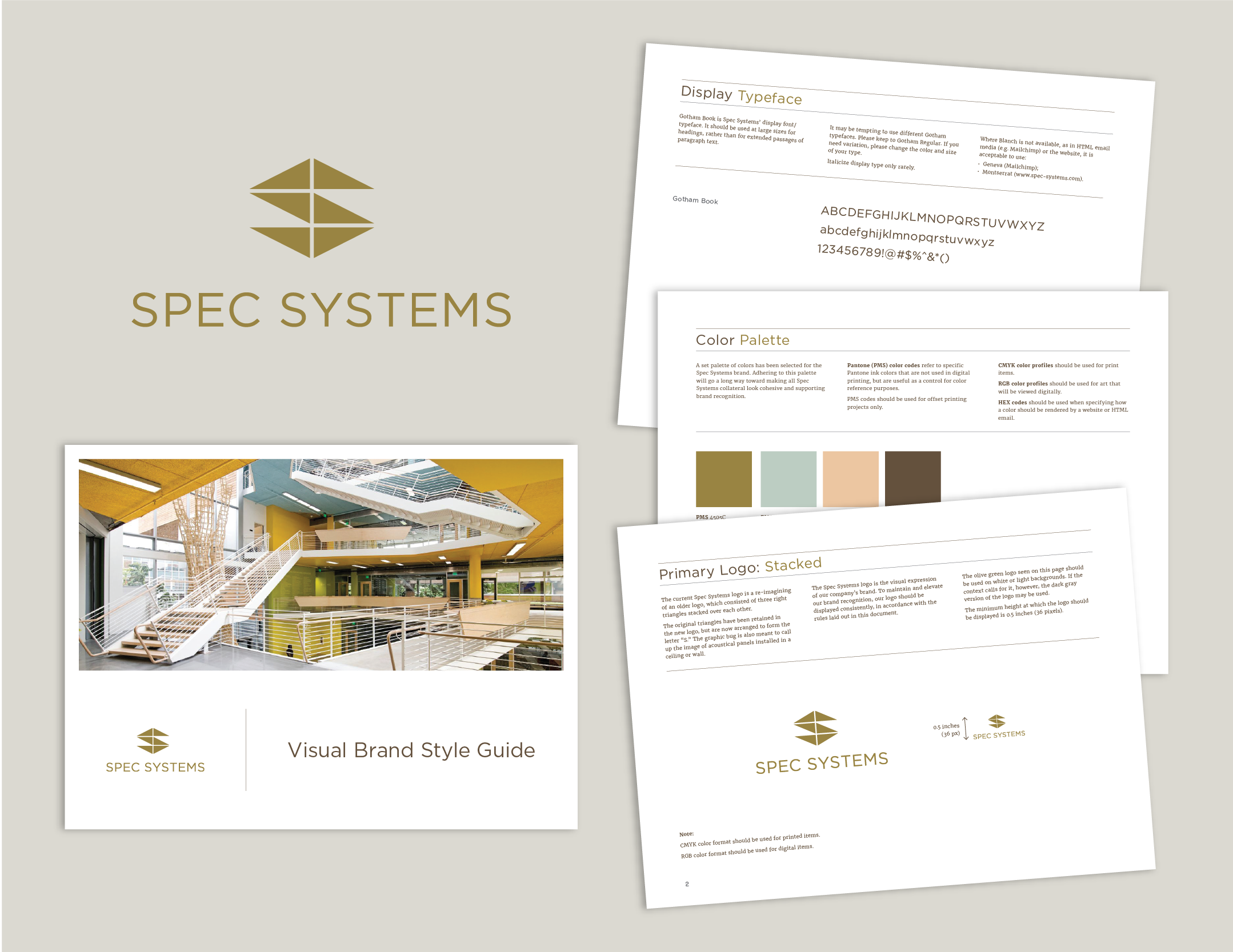
We worked closely with Spec Systems’ owner to design a brand that supported her vision for her company. The result is a logo whose geometry calls to mind the modular acoustical products Spec Systems represent, and a color and font palette that come together for a look that is simultaneously grounded and fresh.
Font and color information, as well as parameters for using the logo, were synthesized into a style guide that we supplied to the client and also refer to internally when designing materials for this client.
Custom-Illustrated Business Cards
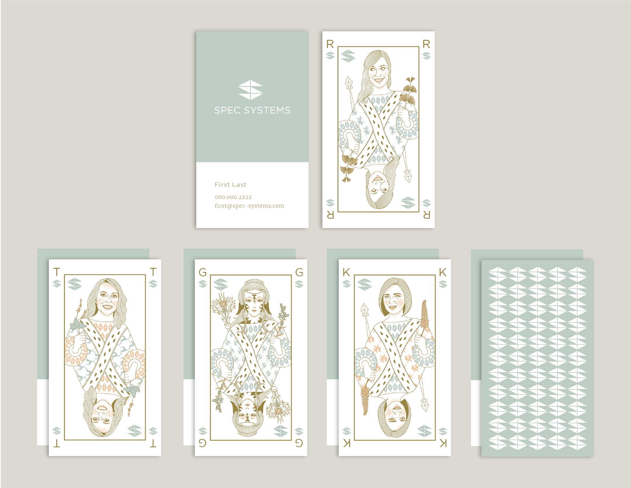
One of our early projects with Spec Systems was the design of their business cards.
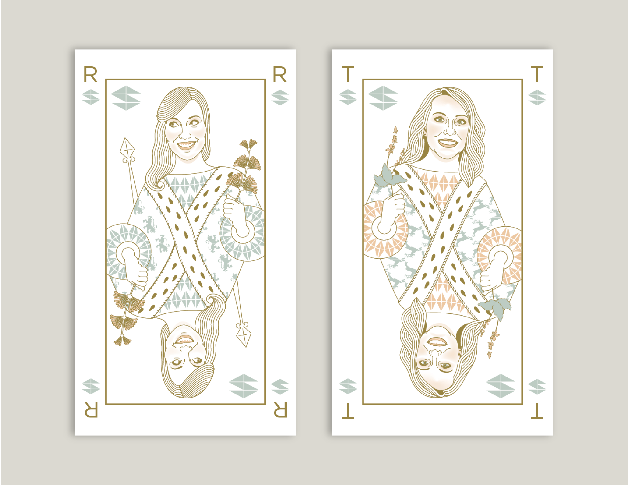
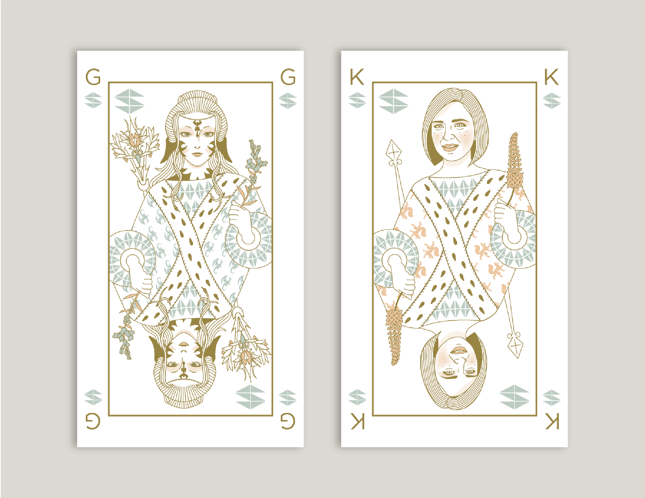
Working in a playing card motif, we illustrated portraits of the Spec Systems company principals and employees, incorporating details unique to that person into each illustration.
Three production methods were combined to produce these cards. Larger fields of color were printed on a letterpress while the finely detailed portraits were printed digitally. Finally, the edges of the cards were hand-painted with metallic gold paint to provide a subtle flourish.
An Online Product Showcase
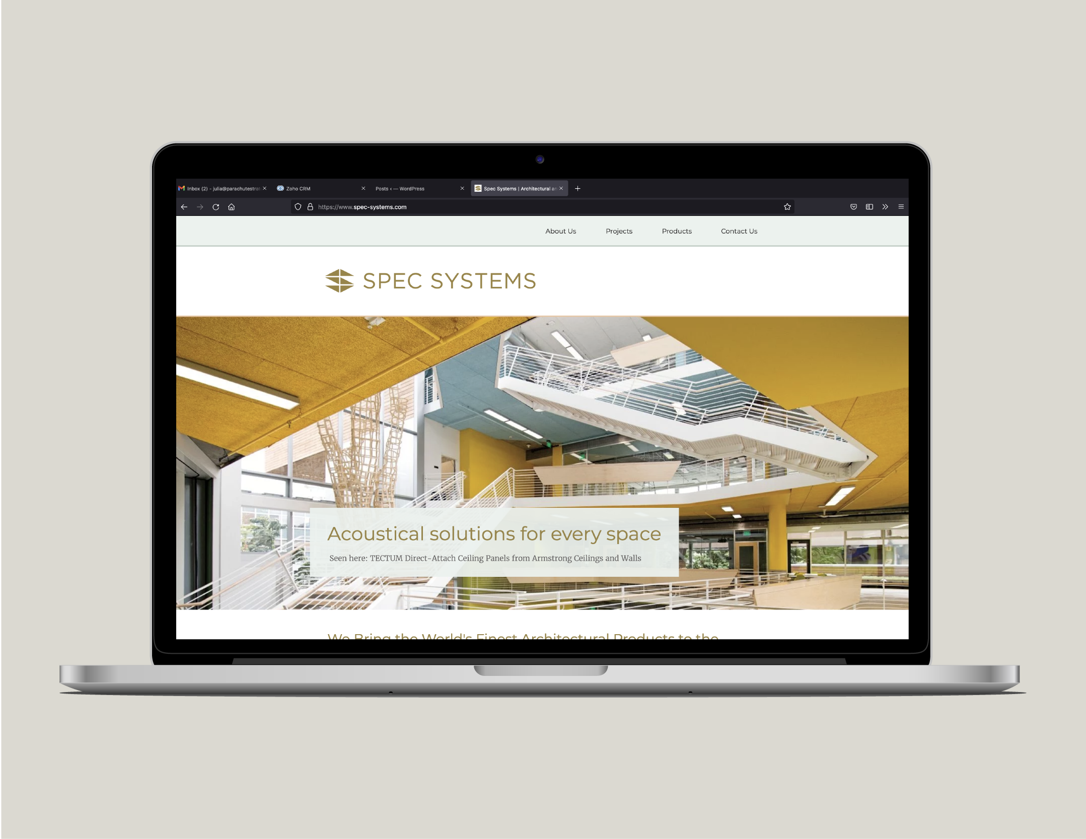
Built in Wix, the Spec Systems website was designed with architects and developers in mind. It features a detailed and image-rich index of the products Spec Systems represents as well as projects in which those products have been used.
Parachute Strategies designed, built, and wrote copy for this website. We manage site content on an ongoing basis, procuring photos of projects as they are made available by architects and developers and keeping the product catalogue up to date.
Materials Library Cut-Sheets
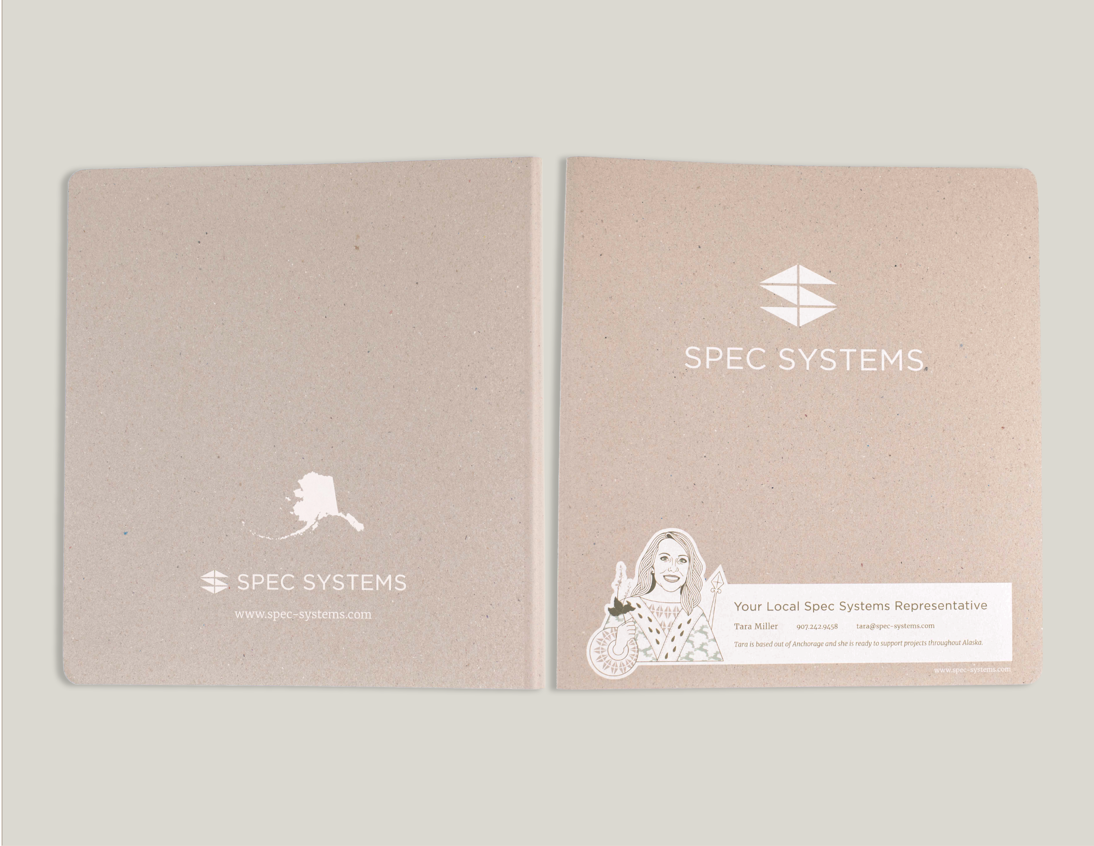
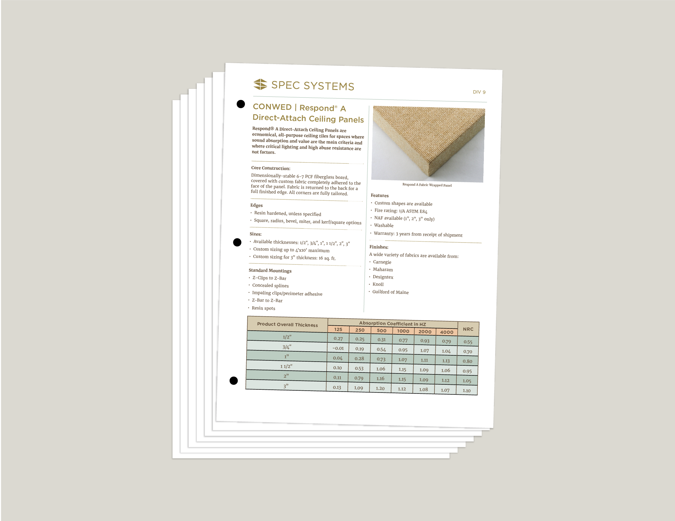
To streamline the materials Spec Systems provides to its clients about the products they represent, we designed a bespoke binder specific to their Alaska market, and stocked it with succinct and informational product cut-sheets. We created a standard, branded layout and compiled and curated product content. This three-ring binder is organized by architectural division for easy reference, and the sheets can be removed for inclusion in a design team’s project specifications.
Tasteful and Charming Leave-Behinds
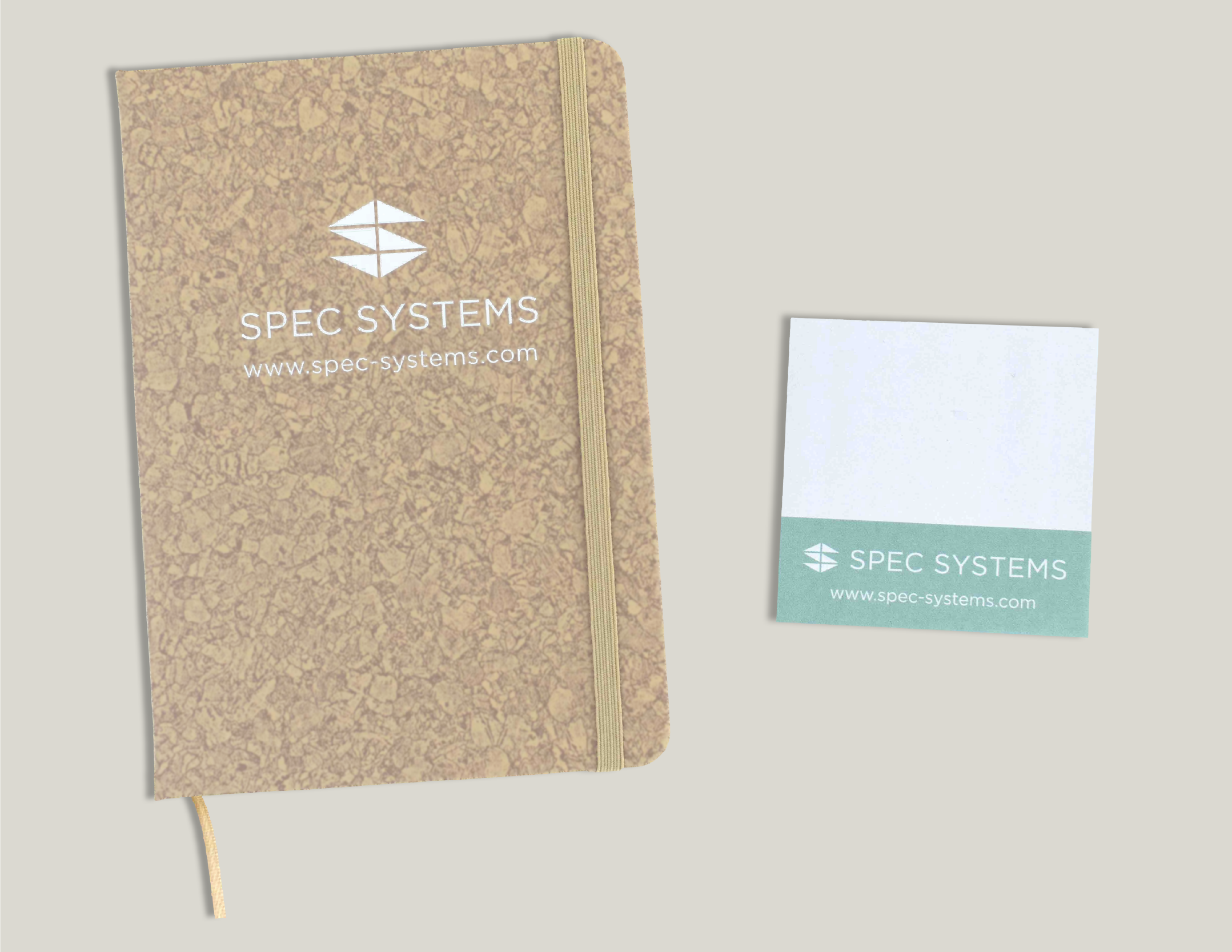
We’ve designed a series of promotional items that Spec Systems leaves with clients after meetings or product trainings and includes packages of product samples.
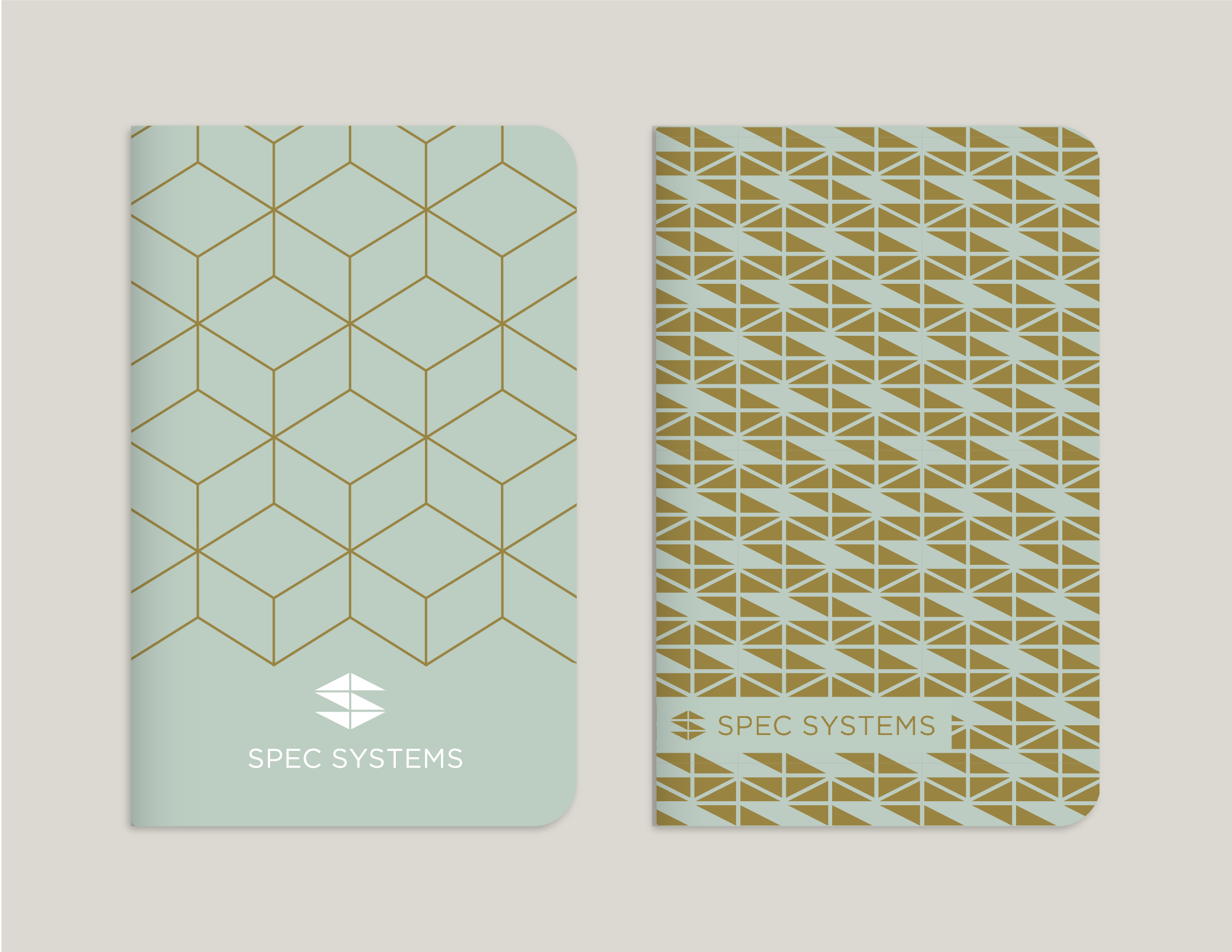
These include stationery products like notebooks and tablets of sticky notes. Among our favorites is a series of soft-cover journals that expand on the tiling motifs built into the Spec Systems brand. Inside are specifically chosen dot-grid pages, a favorite among architects and designers.
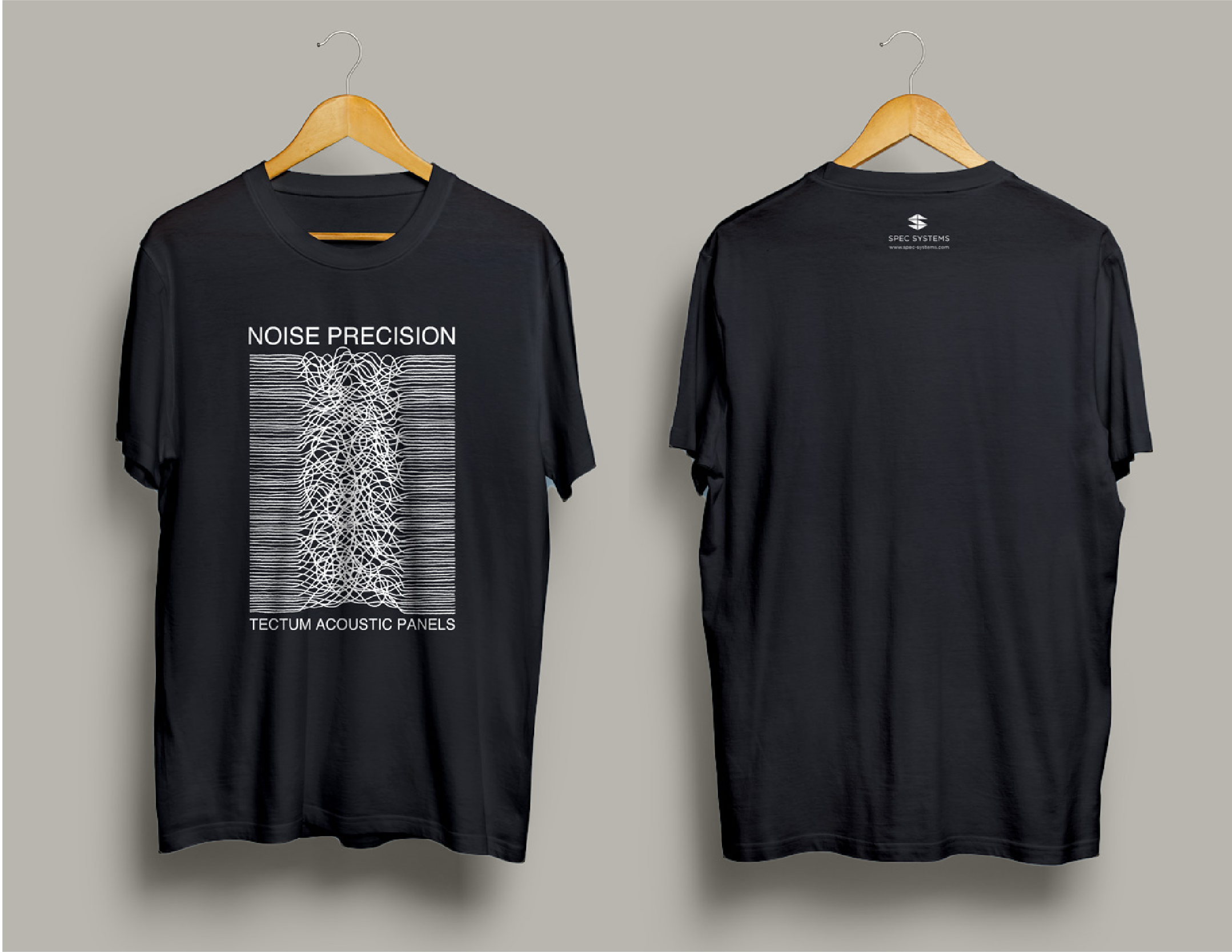
Another of our favorite pieces is a t-shirt we designed and illustrated for Spec Systems. The front of the shirt riffs on Joy Division’s famous “Unknown Pleasures” album art. Our version captures the chaotic swirling of Tectum panels, one of Spec System’s best-selling acoustical products.
Tabling and Trade Show Materials
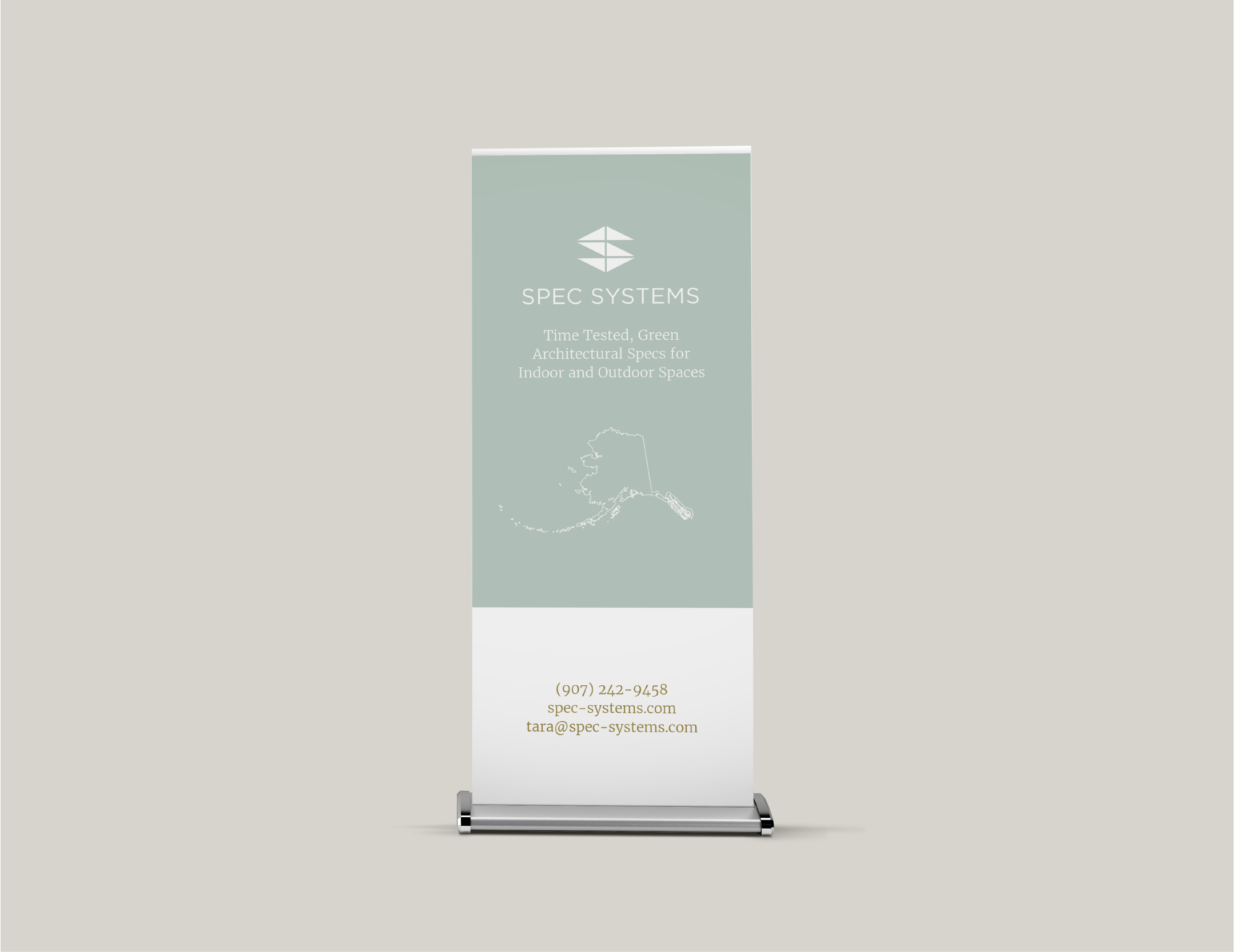
Pandemics aside, Spec Systems typically does a certain amount of tabling, whether at trade shows, conventions, or client-hosted lunch-and-learns. We’ve designed several items—like retractable banners, for instance—to enhance their presence at these events.
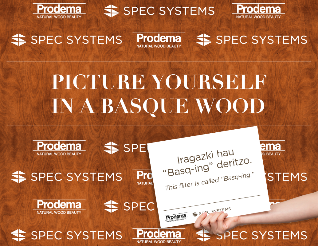
On occasion, we’ve developed immersive materials like a Basque-themed step-and-repeat backdrop promoting Prodema, a wood paneling manufacturer based in the Basque region of Spain. We also produced a number of fun, bilingual, Basque and English placards with Basque idioms and vocabulary that could be held by people getting their photos taken.
